Noblr Car Insurance

Table of Contents
§ Adding Biometrics
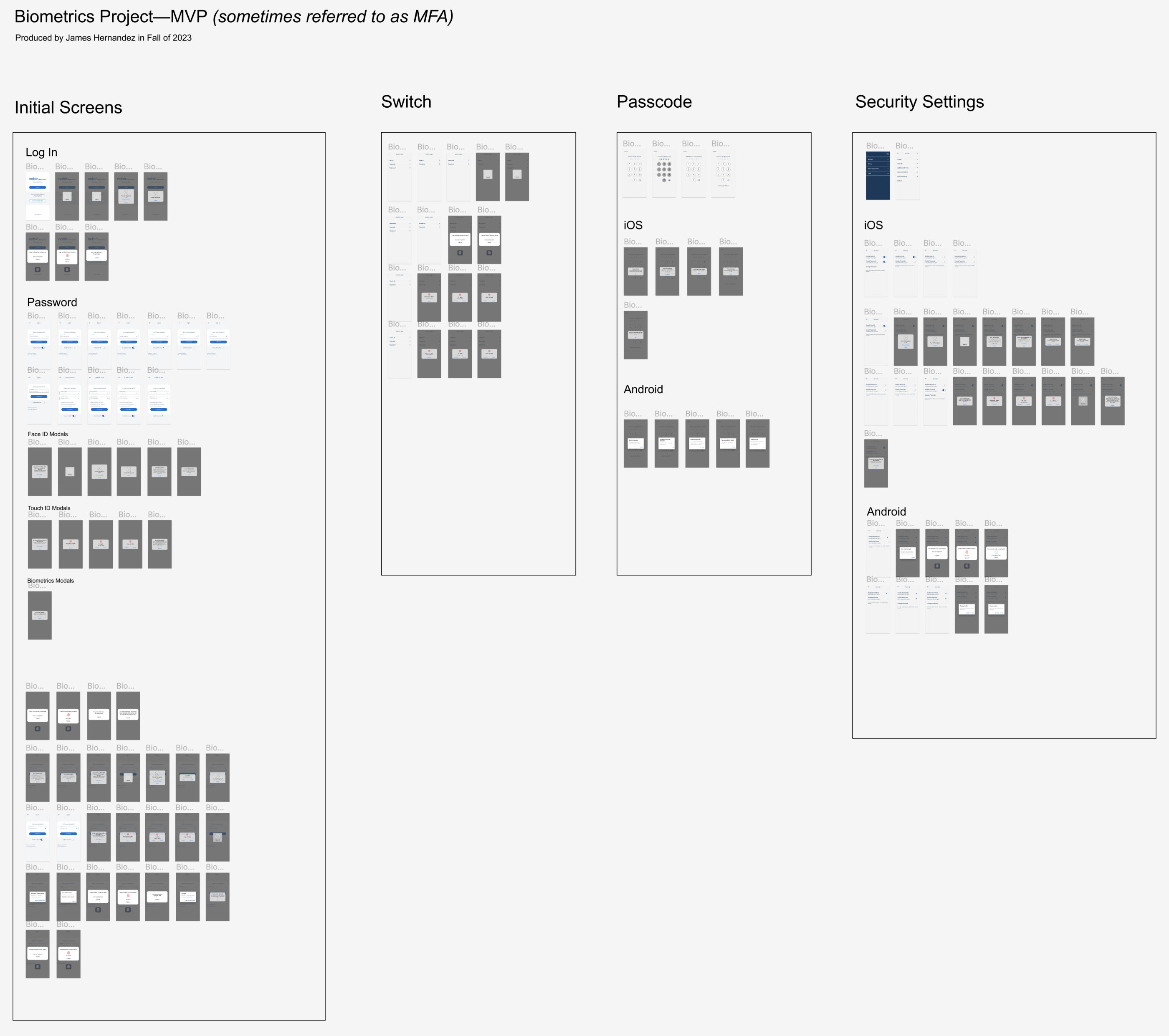
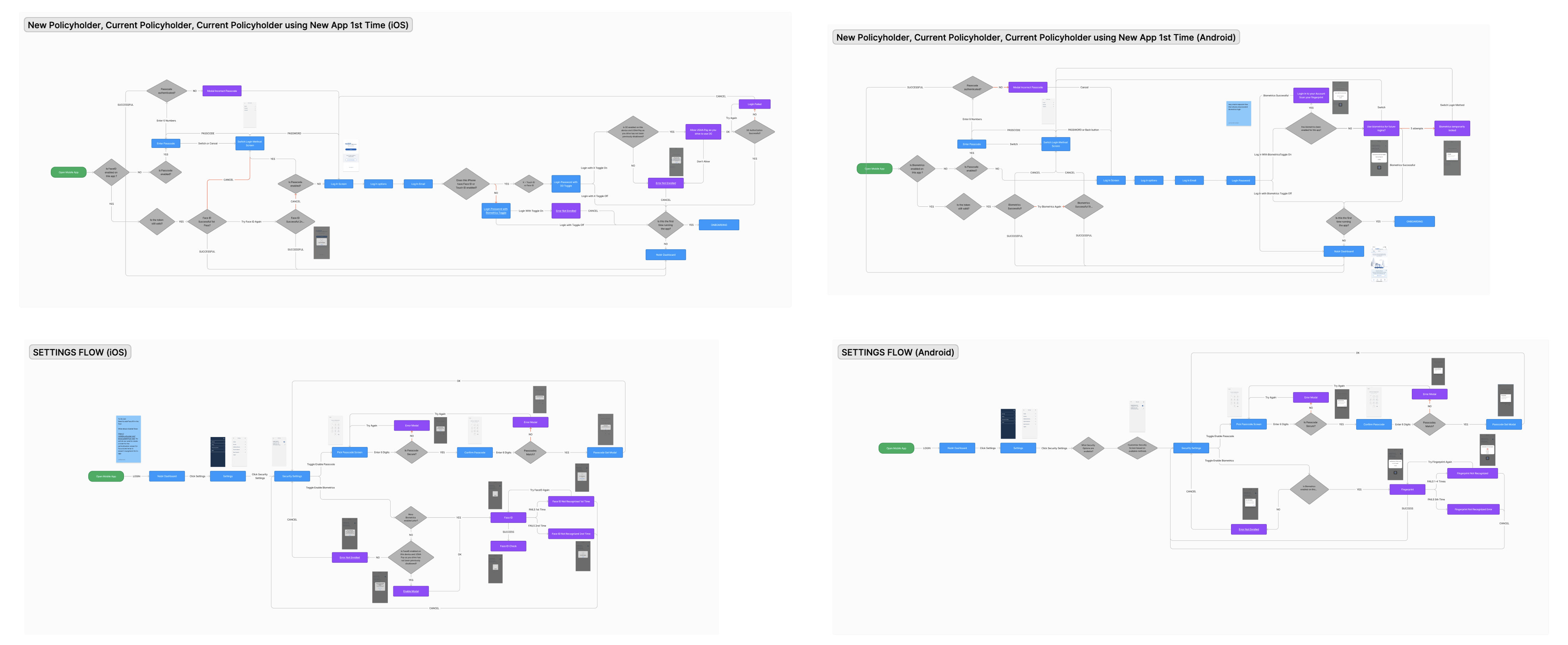
Noblr needed to adopt basic biometric security including facial and fingerprint recognition for both iOS and Android. This required an extensive flow diagram to present to executives and developers when and where users would be presented with these options.
There are a lot of potential screens that can be viewed depending on error handling, or personal preferences. All of these had to be accounted for. The user had to be able to decide to switch from using FaceID to TouchID or a Passcode, and have the options presented in Security Settings.
While the initial flow diagram presented a good starting point, eventually it had to be more comprehensive for developers and architects.
§ Cars Endorsements
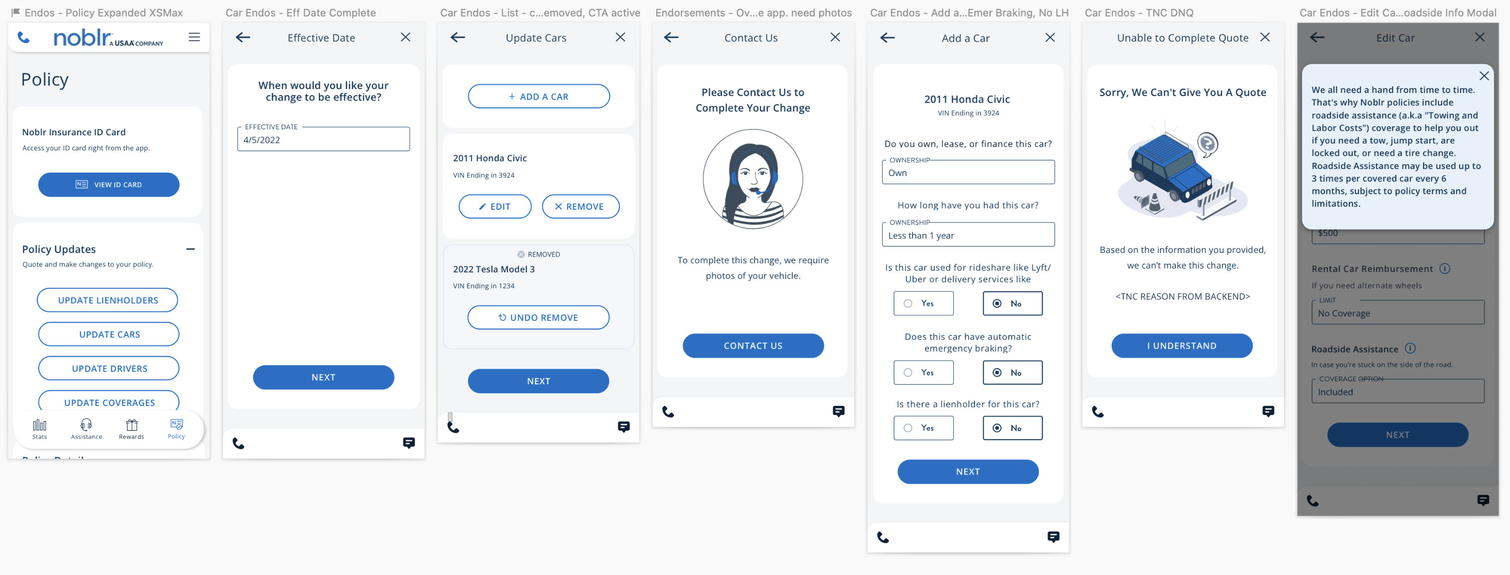
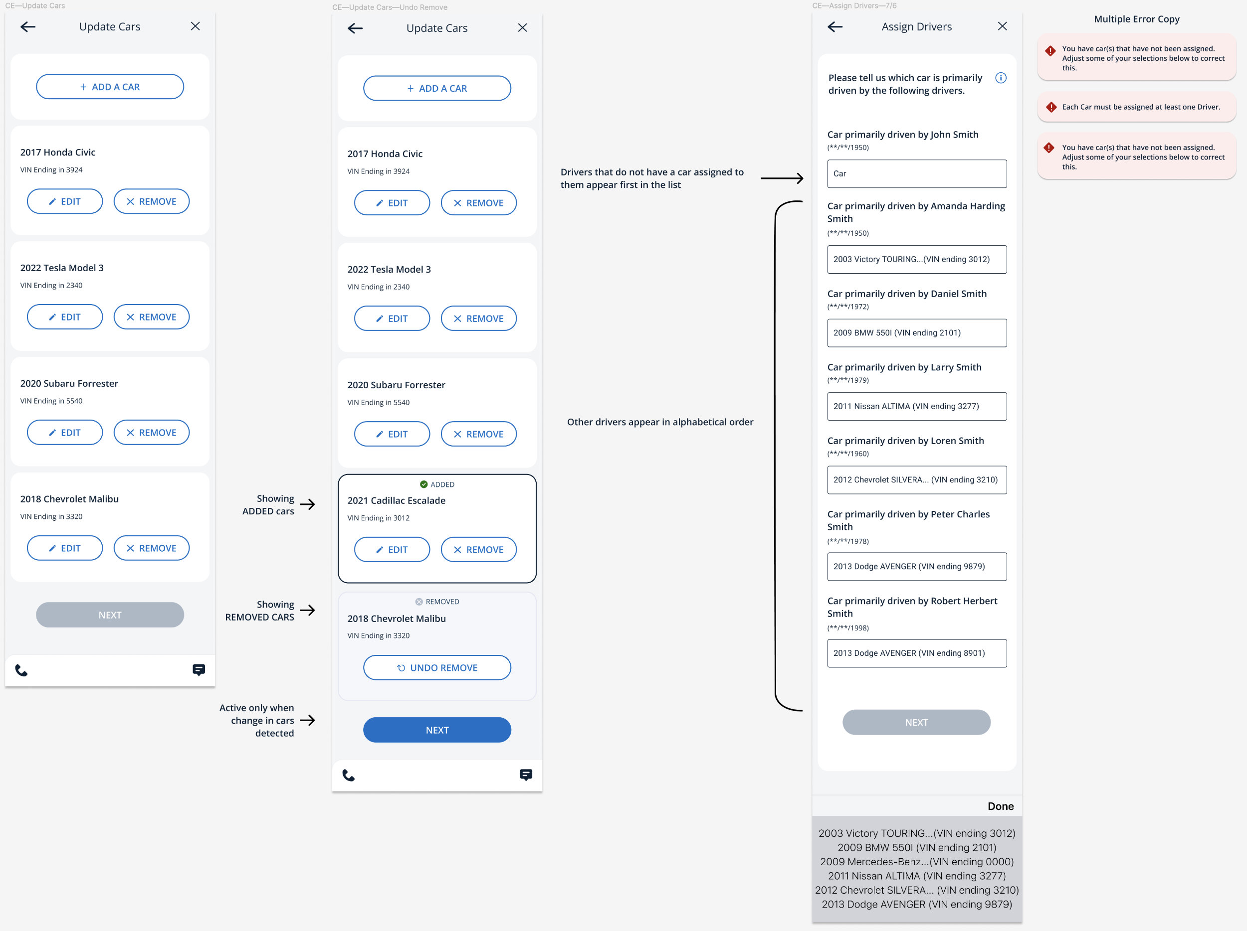
Cars Endorsements is the process by which policy holders add or remove a car from their policy. Significant modifications were made to our mobile app to expand on this capability.
§ Coverage Endorsements
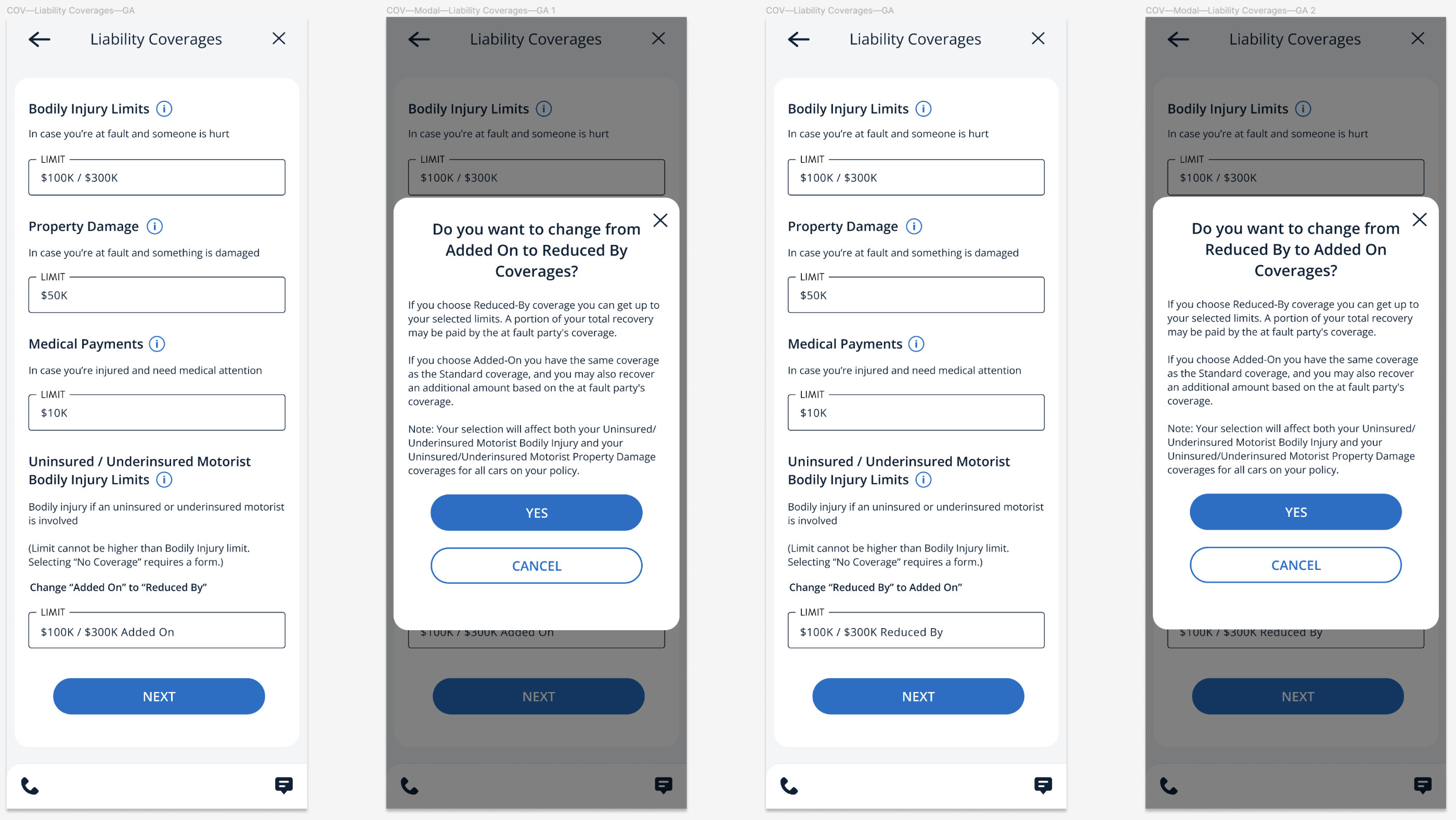
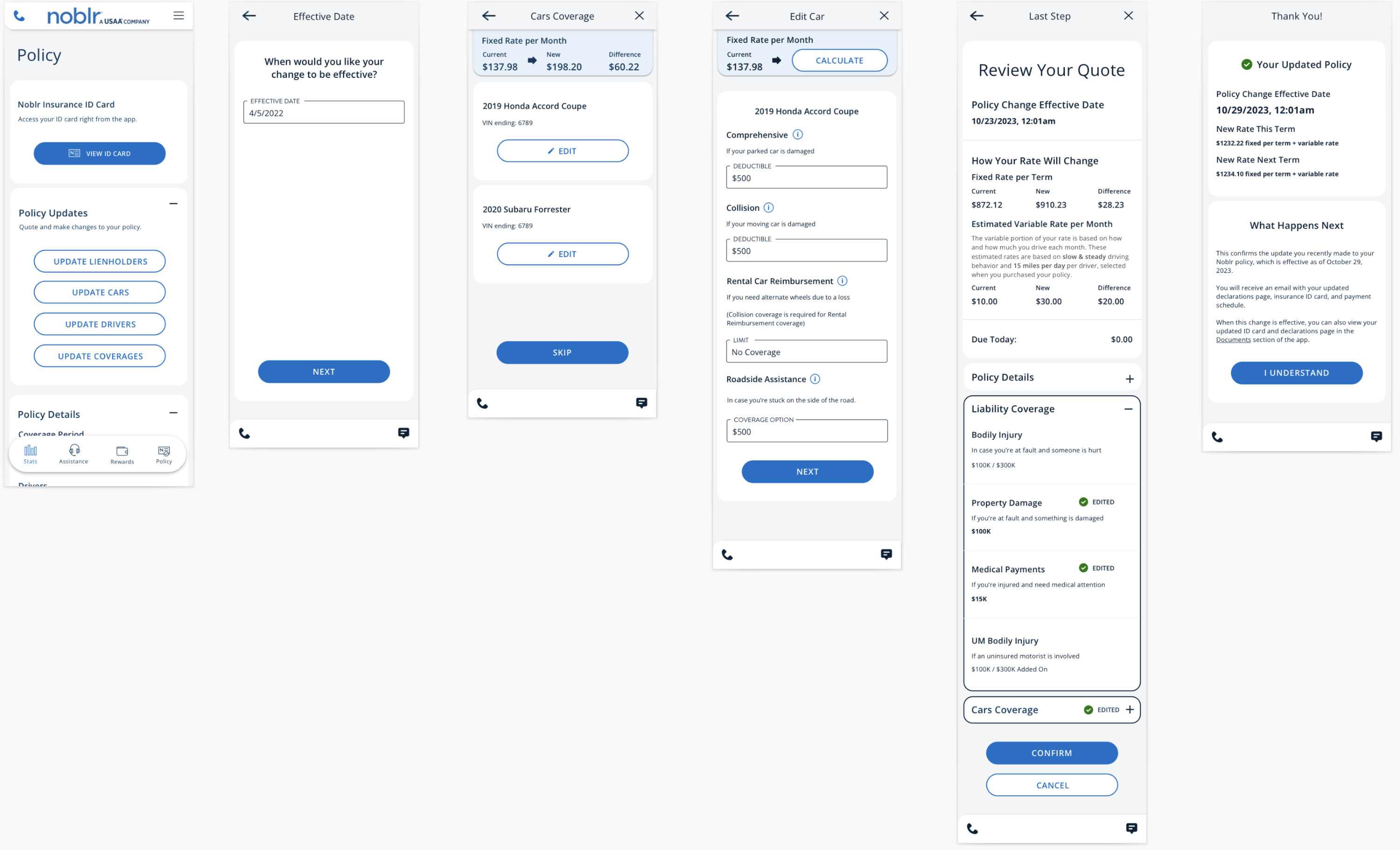
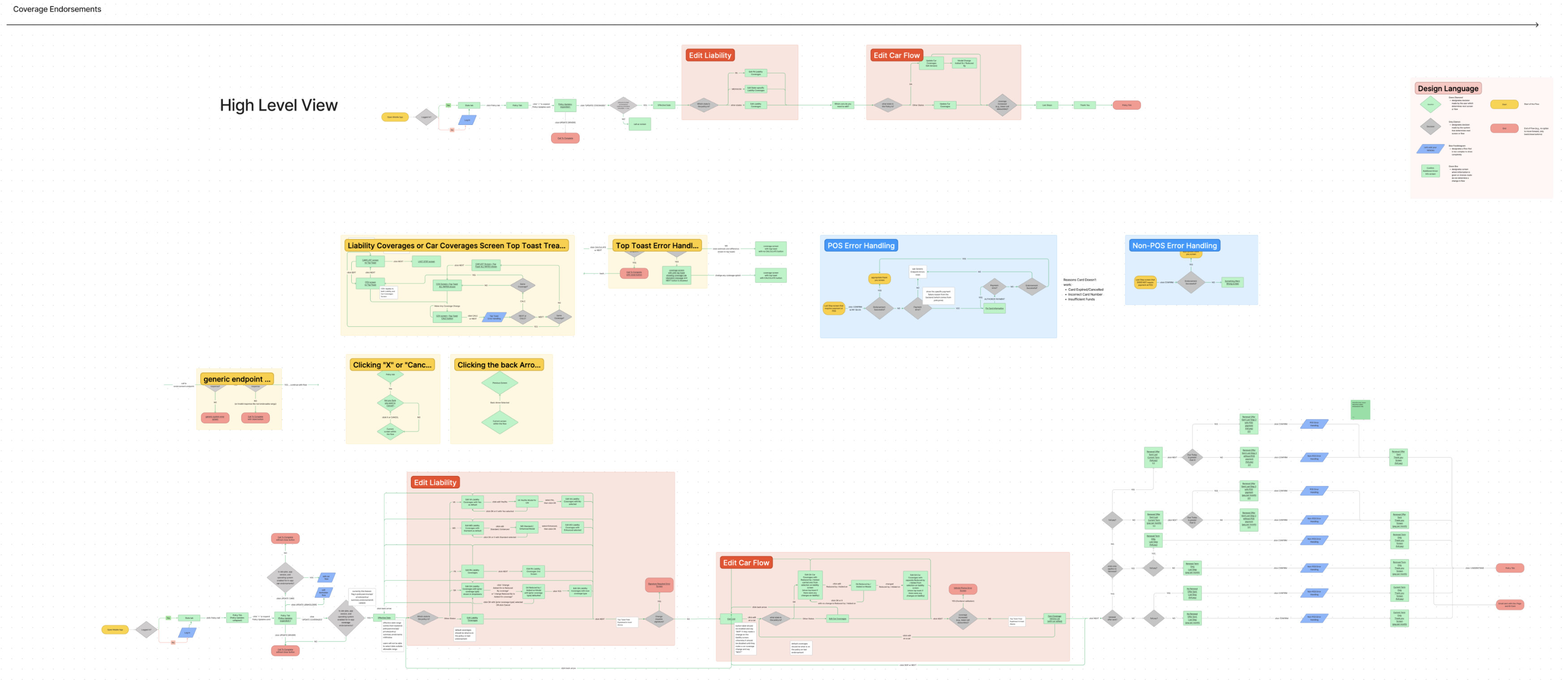
Coverage Endorsements is the process by which policy holders adds, deletes, excludes or changes insurance coverage.
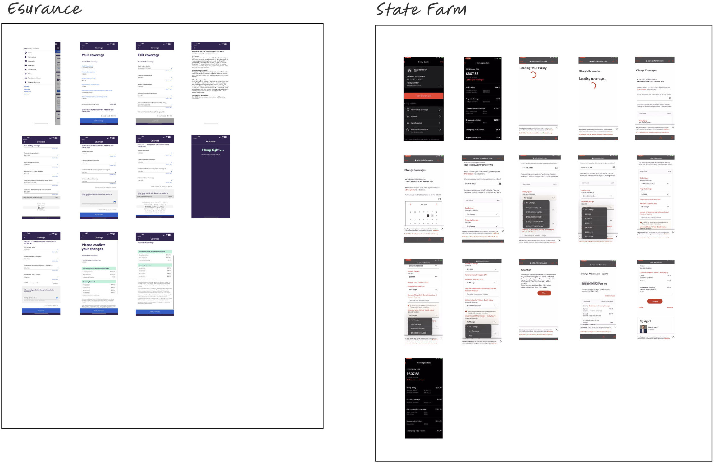
Among the first steps is to research and consider how the competition may have implemented this feature:
If we understand the requirements, we can already dive into creating an initial flow diagram prior to creating any screens.
We can create some initial screens that are applicable in all states and situations.
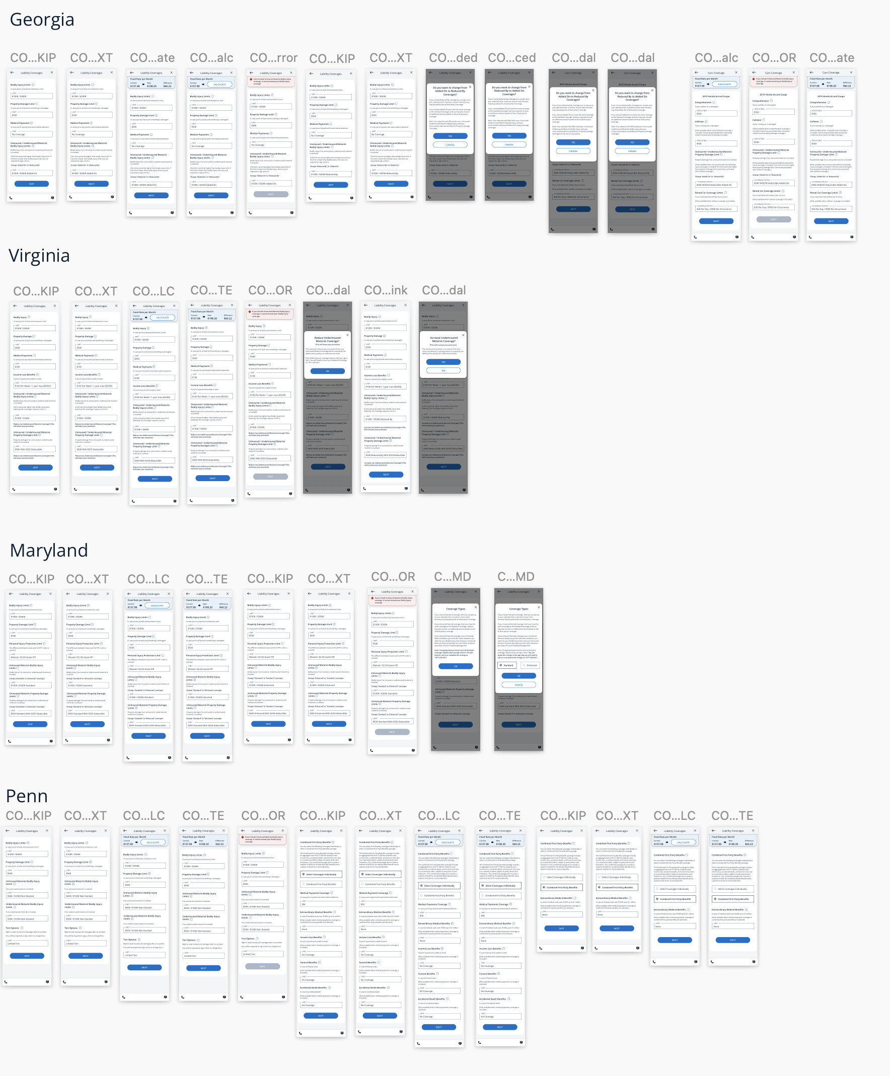
However, as it is with auto insurance, each state has its own specific definitions and requirements.
Each state and situation is eventually accounted for. As with most designs, there are some that are just explained in requirement documents, diagrams, and discussions. Often determining which composites to create is an understanding between project managers, developers, and designers.
§ Gamification Concept
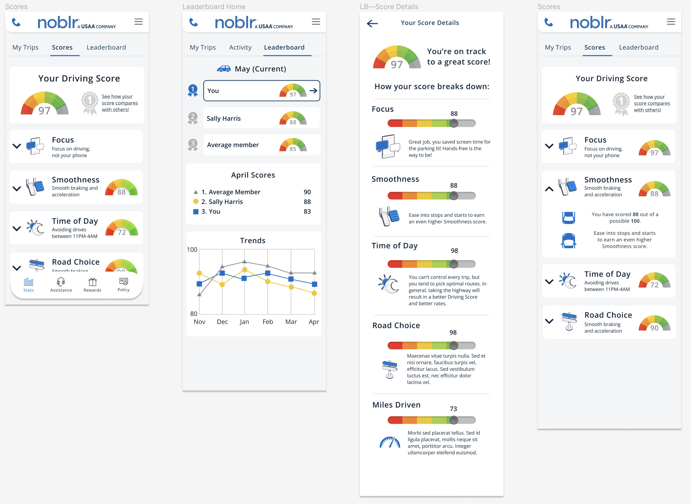
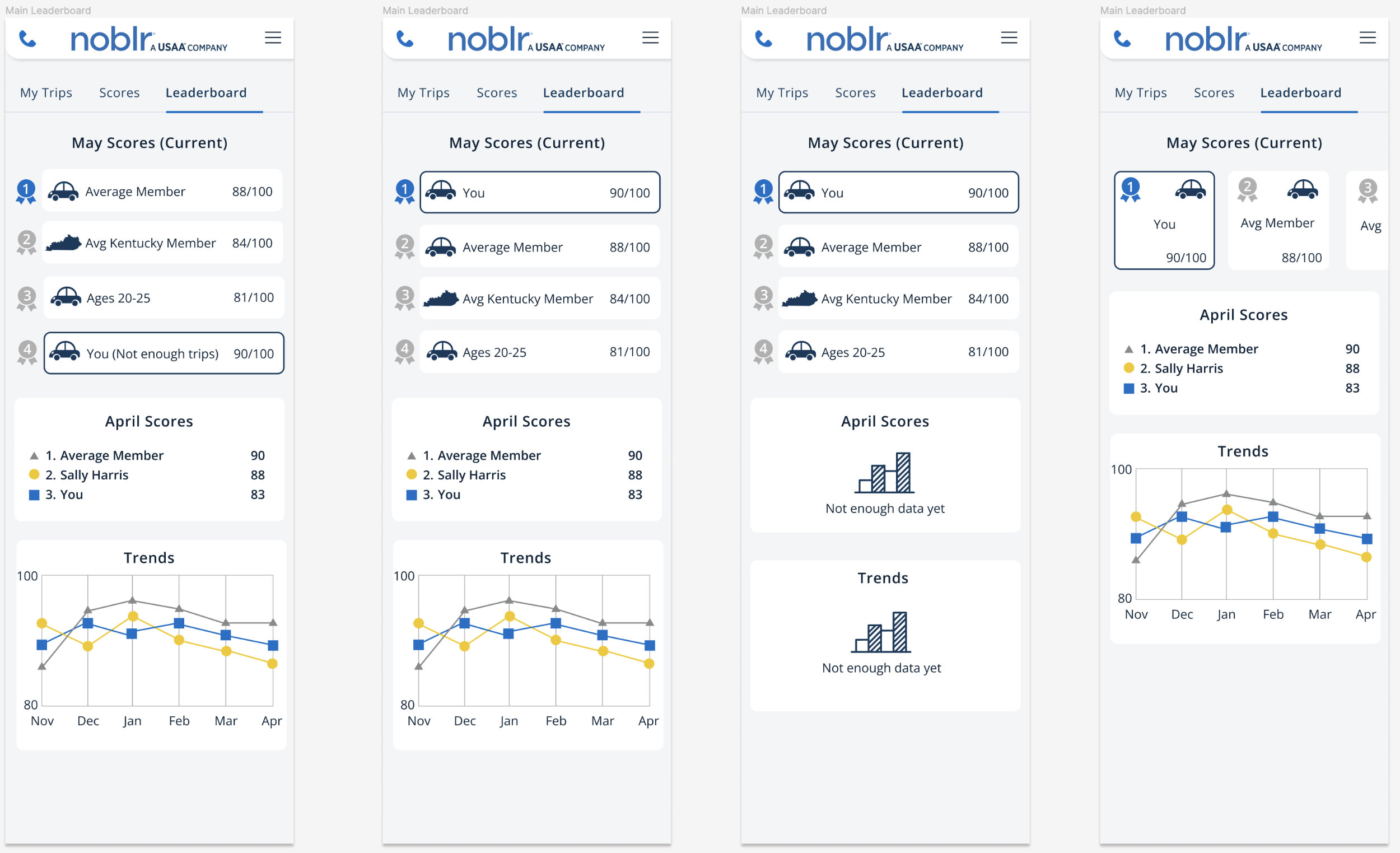
Management considered some options for gamifying driving habits. These options were to engage users to open their application more and interact.
Some of these ideas involved users competing with members of their family or customers in their state to see how they compare.
§ Onboarding New Users
From our research, we determined users were having some struggles getting acquainted with the application. Our onboarding screens sought to remedy this. We needed to let users know some of the mobile features to reduce calls to customer service. Also, the easier a user was able to roll on, the more likely they were to get fewer interruptions to their service and see more savings.
We researched Android settings and vendor differences to create different onboarding for Android users.
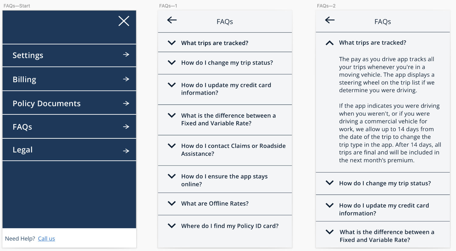
FAQs:


